
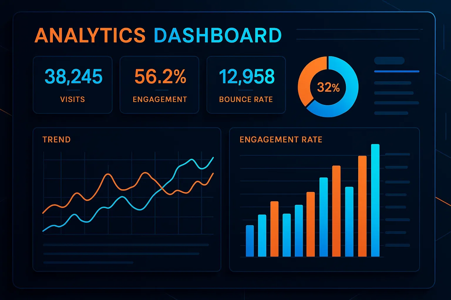
In the ocean of data and shifting social media metrics, it’s more important than ever to build clear, personalized analytics dashboards that not only inform but impress. Whether you’re presenting results to a client or seeking executive buy-in, a well-designed dashboard opens the door to trust and strategic alignment.
Many off-the-shelf tools offer generic reports. But they often fail to highlight the metrics that matter most to a specific client or campaign. The solution is a custom analytics dashboard that:
Visualizes only what’s essential
Reflects your goals and KPIs
Is easy to interpret—even for non-technical stakeholders
The best dashboard tools connect seamlessly with social platforms, allow visual customization, and offer intuitive interfaces. Recommended options include:
To truly impress and persuade, your analytics dashboard should include:
Contextual notes: Interpretations that add clarity to the numbers
Executives want outcomes, not jargon. Clients want proof of value. A well-prepared dashboard shows them why you’re indispensable.
Analytics without context is just numbers. But a custom dashboard is a story with a point, reinforcing your value and elevating how your work is perceived. Customize it, impress, and earn the trust of those who matter most